Whether you’re drawn to Park City’s mountainous landscapes and elevated views or a more classic wedding venue in the valley, bringing colors and patterns into your wedding day can help you create a personal, beautiful wedding that feels unique and full of personality! Using color throughout your wedding design allows you to evoke emotion and showcase your personality. A colorful wedding design can help guests instantly feel your presence in the space—from the moment they walk in to the final toast. If you’re wanting to recreate the same effect, keep reading to learn more about how to choose the right colors for your wedding and how to use them in bold or subtle ways throughout your wedding design!
With a rainbow of colors at your disposal, how do you choose the right ones? Here are three helpful questions to ask yourself when choosing your wedding color palette!
1. What colors are already present in your venue?
If there is already a prominent color in the space where you’ll be getting married, we want to make sure that we are designing with that in mind! An all-white wedding venue can take any color, but if we’re working with deep red or blue carpets, we’ll want to choose shades and colors that coordinate well with what is already in the space.
2. What colors do you typically find yourself drawn to?
What colors do you tend to avoid? One helpful trick: peek inside your own closet. The colors you wear most often are usually the ones that feel most like you!
3. What feelings or emotions do you want to evoke at your wedding?
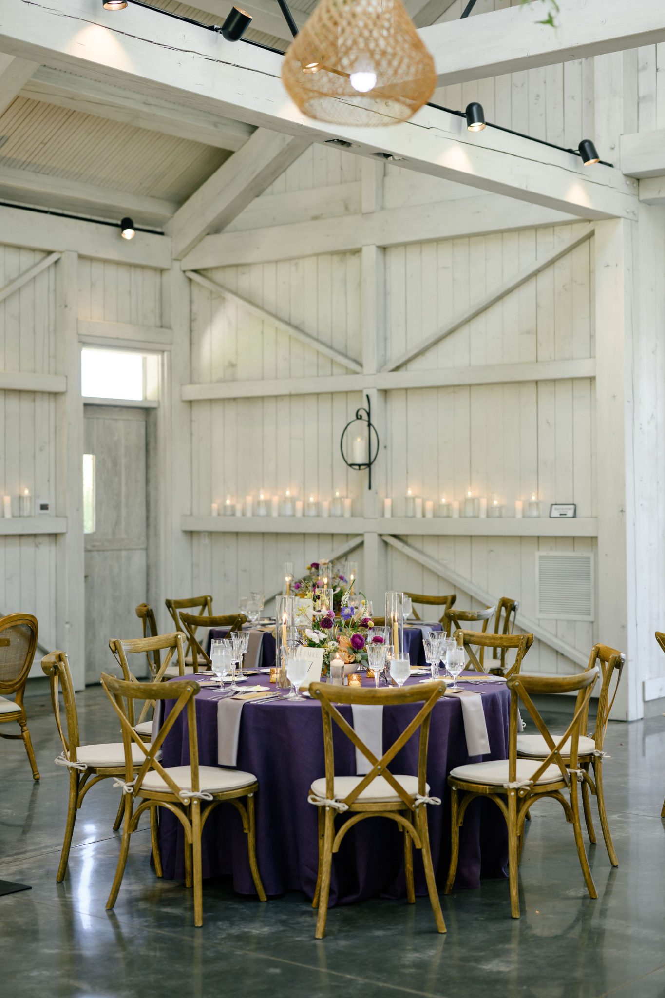
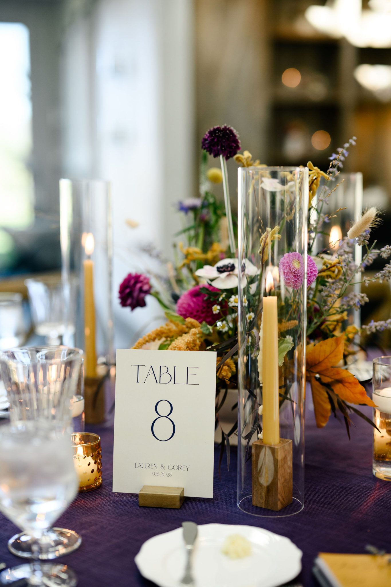
Your overall guest experience is so important! If you want guests to feel energized and excited, we might opt for brighter citrusy colors. If you want things to feel a bit more moody and mature, we might lean into deeper shades. We ask our couples to identify the ideal environment and from there, we’re able to choose colors that help evoke that same sense of emotion.
If you find yourself constantly drawn to color, whether pastels, jewel tones, or bright shades, we have 3 tips to help you use color in a bold way throughout your wedding!
1. Use Colorful Foundations
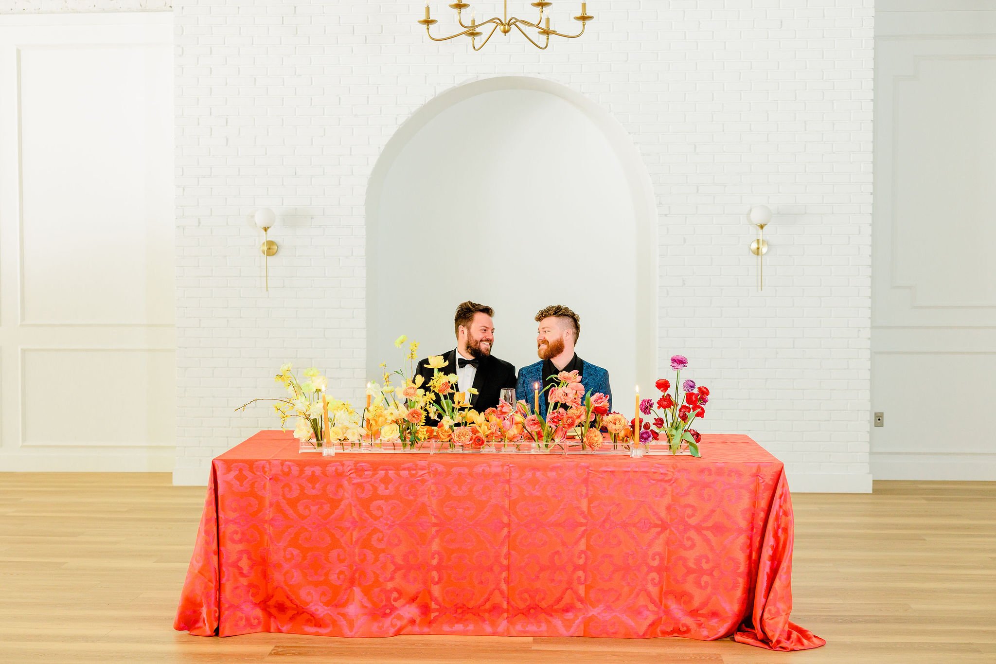
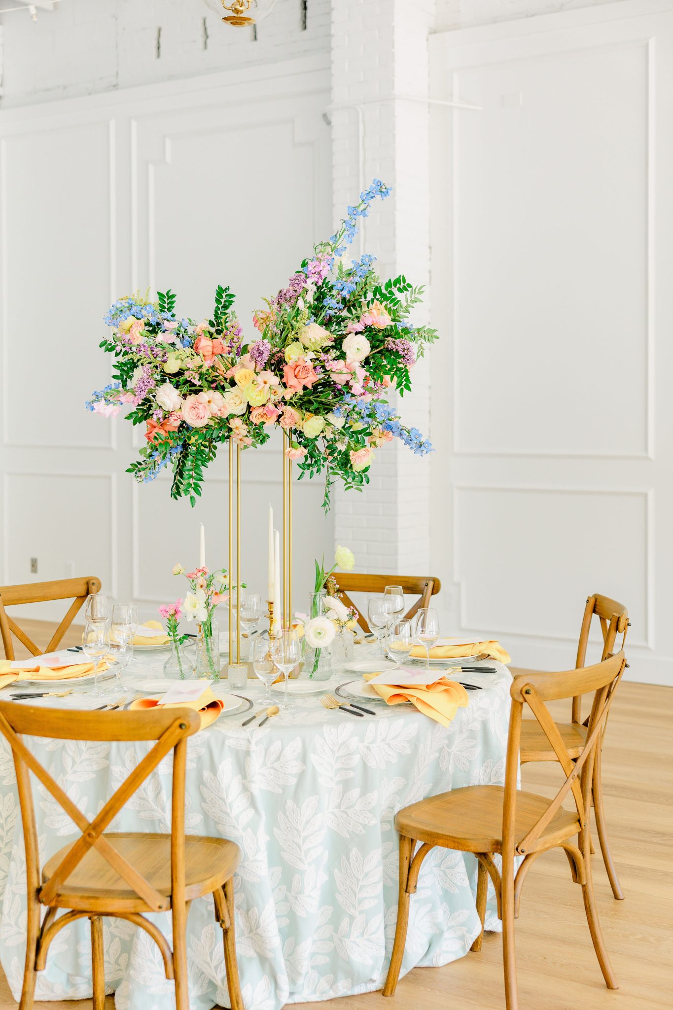
When it comes to weddings, flowers and linens serve as the visual foundation of your wedding design. We love to bring in color by opting for colorful tablecloths instead of neutral shades and accenting with colorful flowers in a variety of shades. This approach works especially well in white-walled venues, where color can anchor your tables and naturally draw attention to the heart of the celebration!
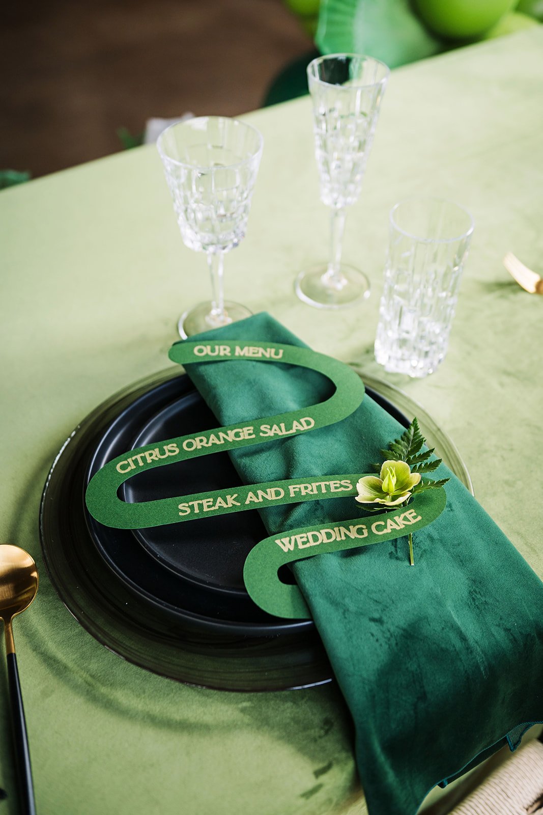
When we think monochromatic, we often think of weddings that use just white or black. A bold take on monochromatic design? Try choosing a single color and using it in a variety of shades for a layered, eye-catching effect. This monochromatic green wedding design is the perfect example of using a monochromatic approach with a more colorful twist!
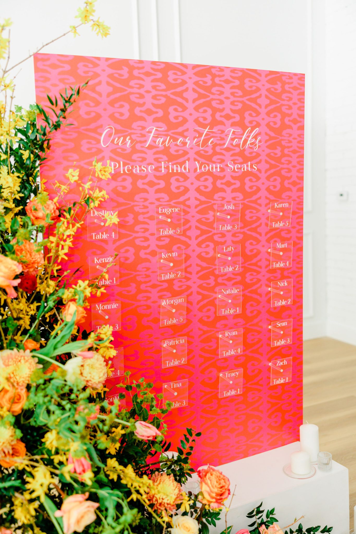
If you’re looking for more patterns and movement rather than solid colors, we love using a colorful motif in multiple places! In this warm, red and orange wedding design, we opted to use the motif from the tablecloth in the seating chart to create a sense of continuity throughout the wedding without needing to have a larger range of colors available everywhere.
If color piques your interest, but isn’t something you want to be quite as prevalent, we have 3 tips for you!
1. Choose a Single Accent Color
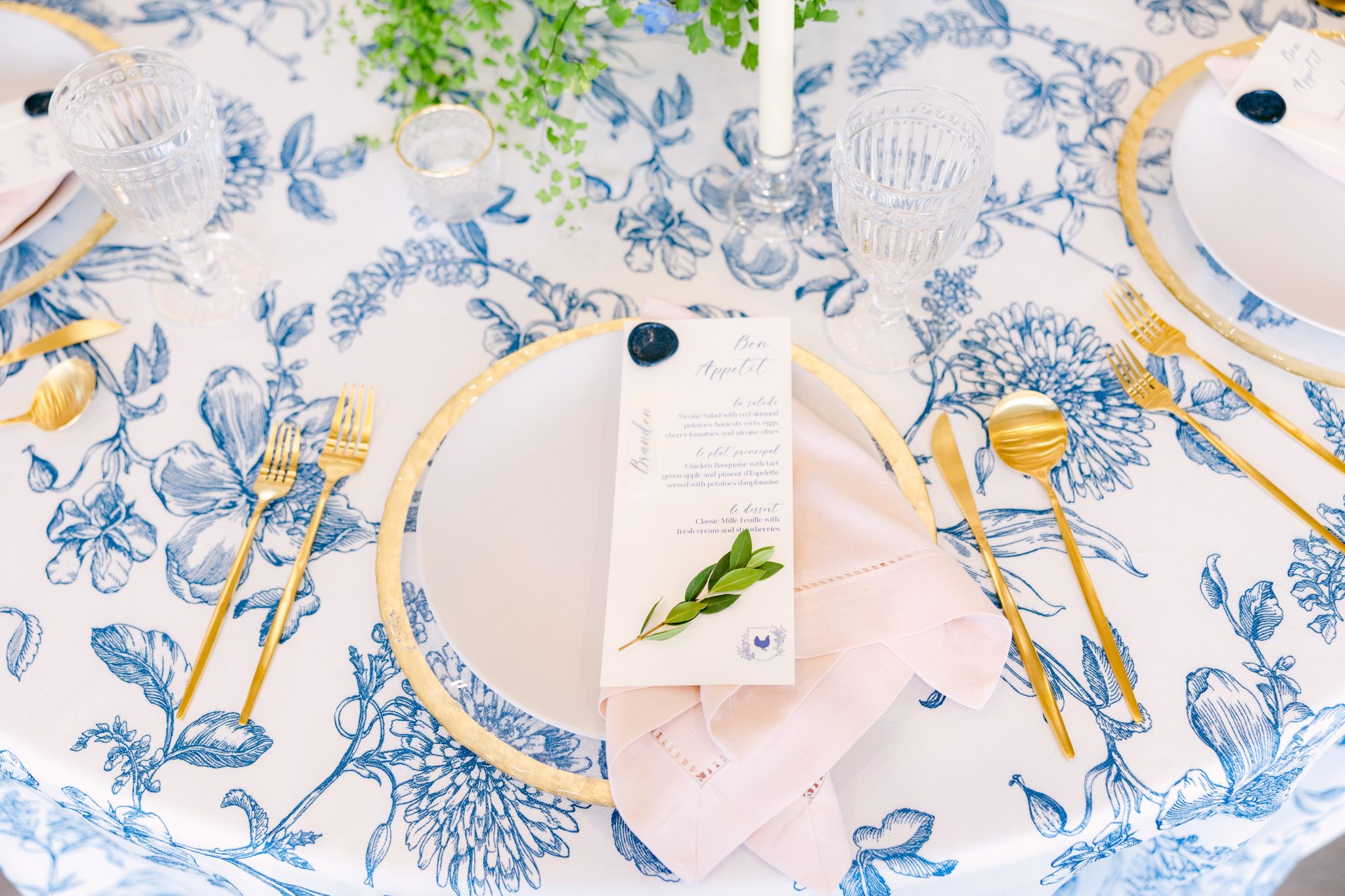
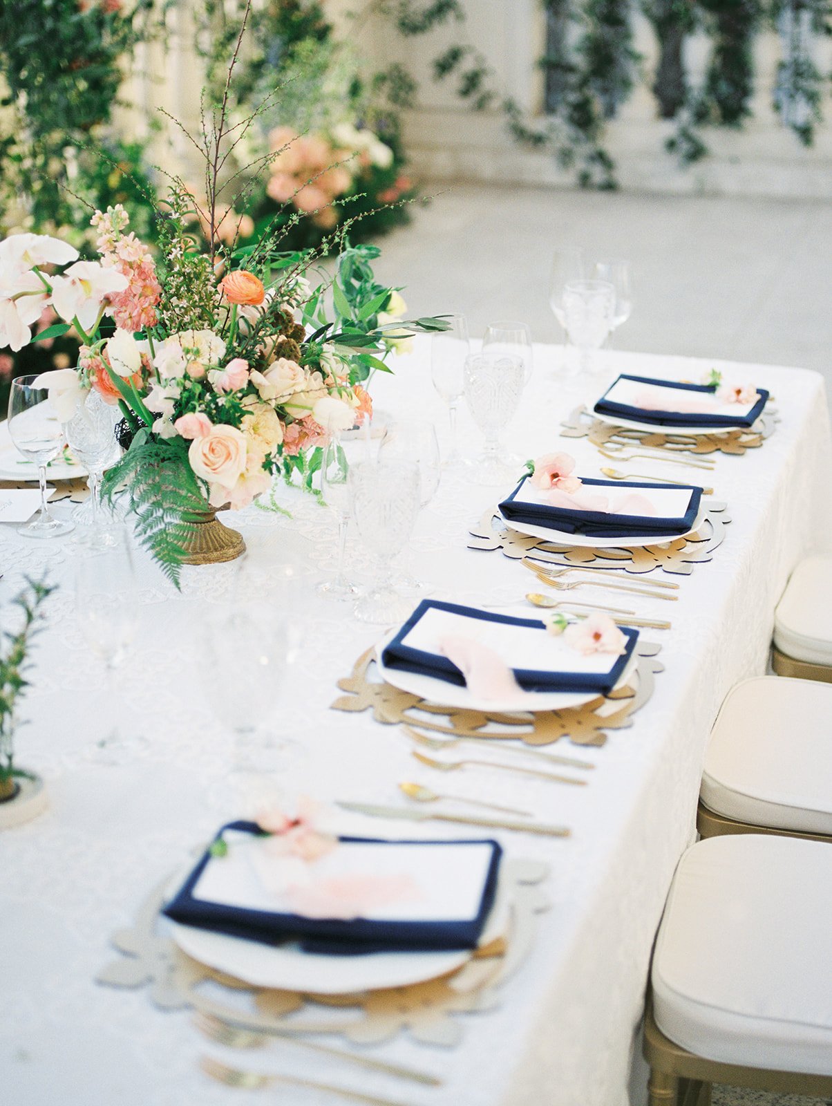
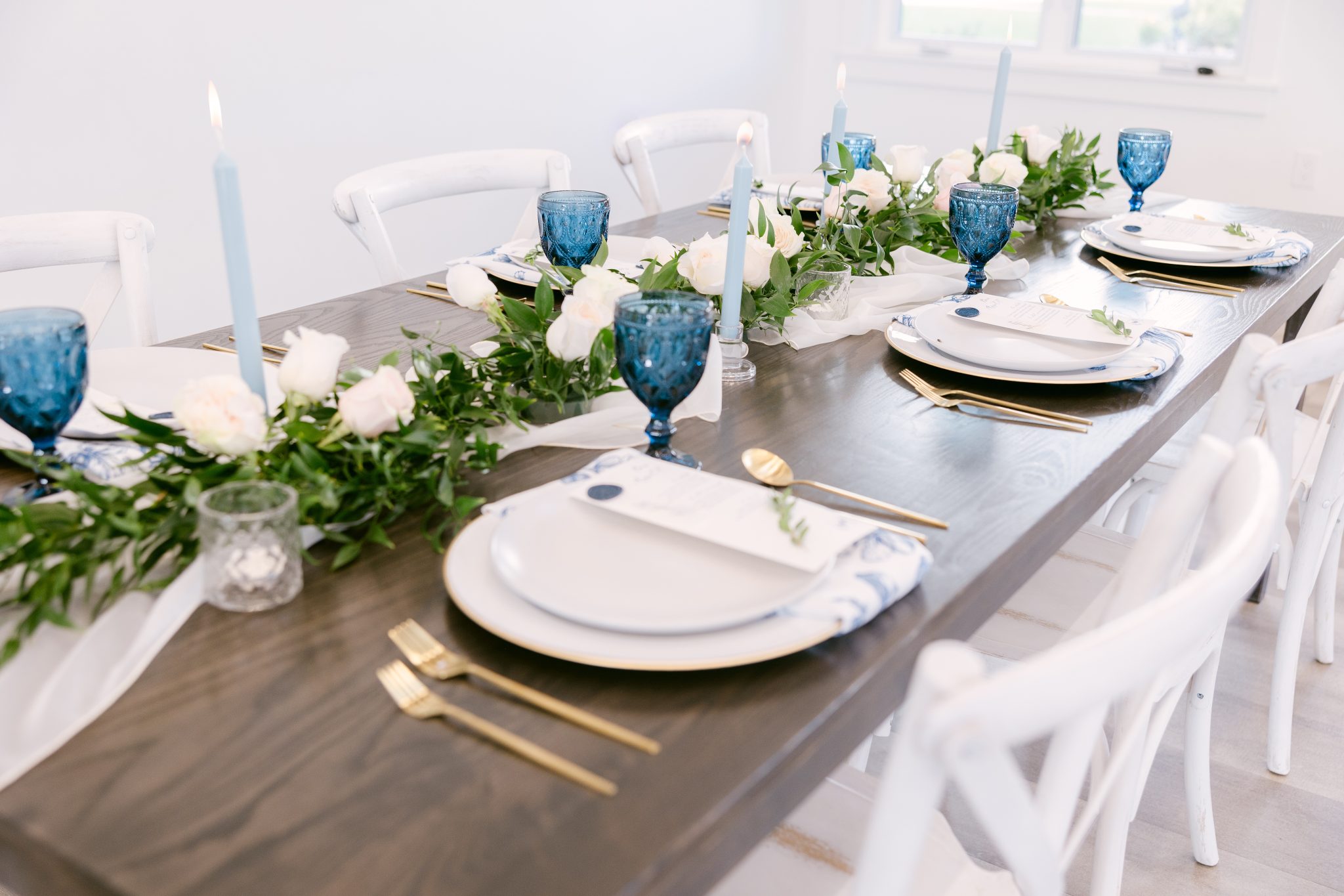
A wedding that primarily uses neutral tones can be the perfect backdrop to a primary accent color! We love these examples that showcase using just yellow or just blue as a color choice on wedding day to bring in a more subtle use of color!
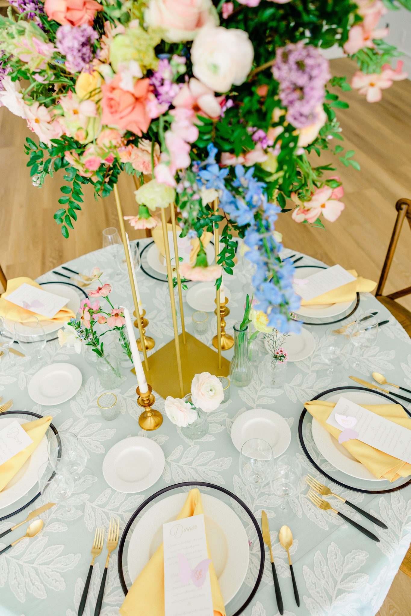
Though colorful in their own right, pastels often feel softer and more toned down. If you love color, but still want things to feel soft, we recommend choosing a variety of pastels in your color palette. Want a little bit more of a pop? We recommend doing a single “rich pop” like the black flatware or black-rimmed charger shown here!
Instead of using a big, large pattern we recommend opting for something simple and elegant that ties in with your overall wedding. A great example? A soft pinstripe or floral-patterned napkin that brings just a touch of visual interest without overpowering the rest of the design.
Using color and pattern is an excellent way to bring a bit of personality and emotion into your wedding day! Whether you lean toward soft neutrals or bold brights, incorporating color and pattern is a powerful way to infuse your wedding with personality and feeling. Choose what feels most like you, and your guests will feel it too.